For job 21, I chose to make my logo on the Pepperidge Farm Goldfish Bowl 2013. I love the colors and goldfish are just fun! 
Graphics and Design | Chattahoochee High School
07 May 2012 Leave a comment
in Imaginarium
For job 21, I chose to make my logo on the Pepperidge Farm Goldfish Bowl 2013. I love the colors and goldfish are just fun! 
11 Apr 2012 Leave a comment
in Imaginarium
My inspiration for this assignment is the David Hockney collage. His artwork is interesting and his collages have depth because of the multiple pictures from all the different angles. He not only does these collages with photos, but also paintings. He makes collages of mostly cities and casual areas with people scattered all over, but he also does some nature scenes. These are some of his art pieces that inspired me. The dimensions of his art are intriguing and very interesting.
16 Feb 2012 Leave a comment
The 80’s were a time of bright neon colors and people finding themselves. It was the time of Michael Jackson, Prince, and Guns N’ Roses. The words or the slang used back then were “bad to the bone”, “airhead”, and “dweeb”. Platinum blonde hair that is ultra teased and multicolored was definitely in style for women. Men were all about mohawks and piercings, while women had bright boisterous make-up. Leg warmers and off the shoulder shirts were on every girl. E.T. was one of the best movies that came out in the 80s along with the Terminator, Die Hard, Ghost Busters, and Scarface.
It was very successful and was another choice people had from the usual Space Invaders game. Pacman got a lot of attention because it was different from most arcade games. Money was the main goal in the life at this time. Money made you successful; money made you who you were and how your life played out. People used to work together and earn money for their country, but in the 80’s people wanted more spending money for personal desires. This is around the time the song “money, money, money” came out by ABBA.


16 Nov 2011 Leave a comment
in Imaginarium
What did you do for each step of the creative process? Describe.
I googled other in depth info graphics for my research and for brainstorming, I just collected ideas from my 3 inspirations. We didn’t sketch, but I just executed the design during class in photoshop and illustrator. Afterwards, I looked over my design and got some ideas of how I can improve it next time.
What is color psychology? How can it affect a composition or design?
Color psychology is how a color relates to a viewers emotions. Depending on your target audience and the point you are trying to convey to your audience, the colors should portray that and if it doesn’t, your design won’t be very successful
How did you incorporate color into your info graphic? Did the color enhance the design? Why?
I used red in my infographic to get the readers attention. It helped by using a little splash of color.


27 Oct 2011 Leave a comment
in Imaginarium
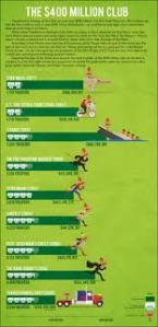
 I like the pictures, colors, and information.
 I like the fact that it winds and makes the reader have fun with it.
 I like that it has good information and a graphic to go with it.
21 Oct 2011 Leave a comment
in Imaginarium
Why is management (organizing your design files) an integral part of the job/assignment process?
If you do not organize your files, there is a higher risk of losing some of your design which would be extremely bad for you as well as the customer.
What is the resolution necessary for printing images from photoshop?
300
What is the resolution necessary for displaying images on a monitor/website?
72
Name the principles of design and define each in your own words.
emphasis- making one part of a design the main focus
contrast- parts of the design are different from the rest
unity/variety- everything different in the design comes together
figure/ground- designs come together, but are somewhat separate image inside an image)
proportion/scale- size of components in a design
balance- equal on both sides of design (symmetrical and asymmetrical)
repetition- repeating elements in a design
rhythm- all of the design flows together
20 Oct 2011 Leave a comment
in Imaginarium

I chose this as my inspiration because most people these days communicate via internet email and this shows the actual percentage of the people that check it do so often. It also has a picture that relates to the subject.

This is another one of my inspirations because most college kids these days are planning on studying abroad so it relates to most people. It also shows patriotism with the flags and the globe helps get the point across.

I like the picture in this one and it relates to a vast majority of the population today.

I like how it pertains to todays sicknesses because its flu season. The picture helps.
14 Oct 2011 Leave a comment
in Imaginarium
What is impositon?
Imposition is the arrangement of pages to assure correct page sequence after printing.
Why is it an important part of the prepress process?
If you don’t include imposition in the printing process, the product will end up all over the place with no clear direction or order.
What other steps are considered to be part of the prepress process?
Proofing or checking everything for errors.
What is the difference between reader spreads and printer spreads?
Reader spreads are pages in order of reading. Printer spreads are pages in order of printing.
What is a spread?
A spread is two pages put together.
14 Sep 2011 Leave a comment
in Imaginarium
I like the way they manipulated the letters into the design.
This inspired me because it has our colors and it would work reallr well for our cover.
I like the feeling that this picture portrays. It makes the viewer feel relaxed but still interested.
25 May 2011 Leave a comment
in Portfolio
Throughout the time I spent in Graphics this year, I’ve learned a lot. For example, I learned how to use 3 very complicated networks: Photoshop, Indesign, and Illustrator. I don’t think I have a personal style at this point in time, but I hope to develop my own individual technique. Many things inspired me from my family to my classroom and even my teacher, Mrs. Dayton!
As you can see from my portfolio, what inspires, or how I feel at that point in time, me shows in my designs. I can be very original and imaginative at times and I do have some strengths and weaknesses. A couple of my weaknesses is that it takes me a while to come up with an idea to start me off, but once I get started everything is great, and I’m noot very good at drawing or creating things very well. One of my strengths is that I’m good with color and photography. I find drawing very challenging because I feel it takes a lot more creativity than just taking a photo and with photography, I feel it’s easier because when you look through the lens everything is clearer. I got the most knowledge using Illustrator because there is so much you can do to a design in that one program. I would like to work more in Photoshop because I love putting pictures together to create something new. I used to be a huge procrastinator, but being in this class has taught me to do my work as fast as possible and I end up getting a better grade than I would have if I procrastinated. I hope to keep this work ethic throughout my future.
Graphic Design has taught me a lot not only about creativity, but also about the computer, work ethic, and thinking out of the box. I hope to stay in Graphic Design throughout high school and carry the things I learn here all through my life.